Mike Morrison, a PhD student at the University of Michigan, knows what’s up. He is trying to change the way scientists present information. That’s good. Here’s his mockup for a science poster.
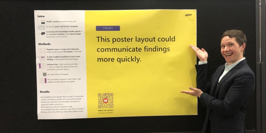
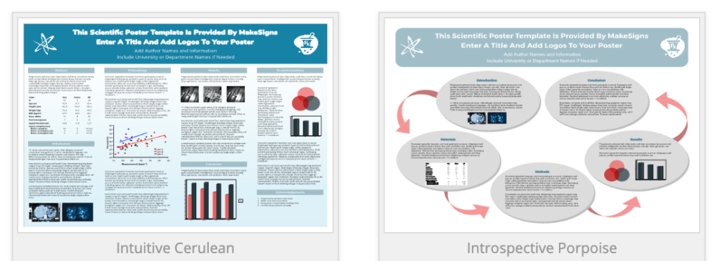
Posters usually look like this. In fact, these are from a free scientific poster template website. Zzzzzzzz. More importantly, they don’t communicate well. They lack built-in hints for where your eye should go first, then second, then third. There’s no prioritization of what’s important.
Here is Morrison’s template, also free.
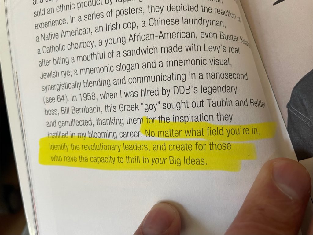
This reminds me very much of a truth about design Emer shared recently.

Leave a response
Responses
No responses