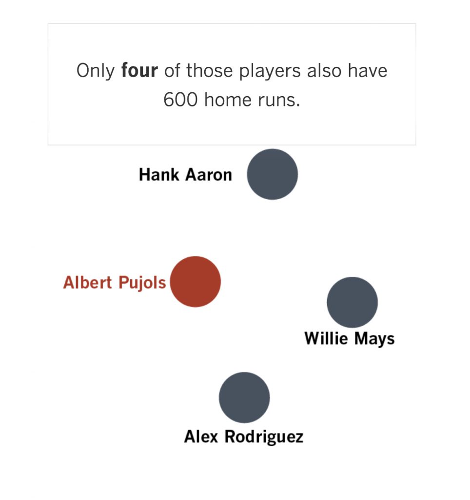
I’m not a sports person and would, therefore, have never seen this were it not for my new favorite morning read The California Sun (which gathers a wide range of interesting California news and tidbits.) Anyway, check out how nicely this LA Times interactive data visualization makes its point. To actually experience the animated version of this, here’s the link. It’s done by the Times’ Joe Fox.

![]()
![]()

![]()
![]()


Leave a response
Responses
1 response